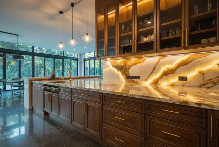
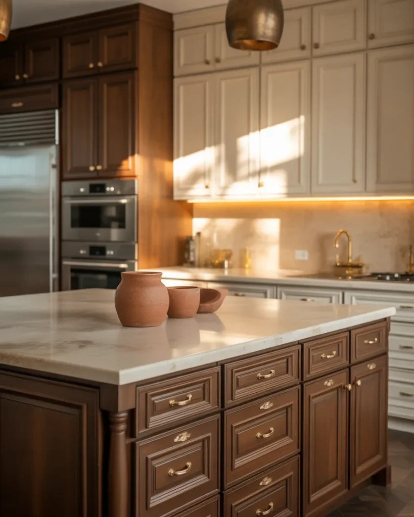
Forget everything you thought you knew about kitchen colors. The all-white era is officially over — and what’s replacing it is infinitely more interesting. From rich burgundy wine tones to fog-kissed sage, these are the 13 kitchen color palettes that top designers are reaching for in 2026. We’ve included paint pairings and hardware recommendations.
PALETTE 01
Dusty Sage + Warm Brass
| Dusty Sage | Warm Brass | Creamy White | Warm Linen | Warm Wood |
Sage green has been climbing the charts for years — but in 2026, it’s grown up. The dusty, muted version of this palette strips away any sweetness and replaces it with genuine architectural calm. Think of it less as “garden green” and more as aged verdigris: a color that’s been somewhere, seen things, and settled into itself beautifully.
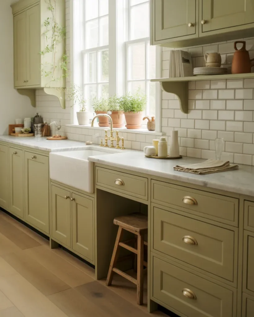
Pair dusty sage cabinetry with brushed brass hardware and you have one of the most coveted kitchens of the decade. The brass doesn’t just complement the green — it warms it, preventing the palette from reading cold or clinical. Creamy white countertops and a farmhouse sink keep the look grounded and livable.
Details at a glance
| Cabinet Color | SW Halcyon Green / BM Sage Wisdom |
| Wall Color | BM Simply White or F&B Wimborne White |
| Hardware | Brushed Brass / Antique Gold |
| Countertop | Pale Quartzite or Honed Marble |
| Best For | Traditional, Farmhouse, Transitional |
| Mood | Calm, Grounded, Timeless |
Designer Tip: Use sage on the lower cabinets only and keep uppers in creamy white. This two-tone approach prevents the green from feeling heavy in a smaller kitchen while adding that coveted color grounding at eye level.
PALETTE 02
Mocha Mousse + Warm Cream
| Mocha | Caramel | Cream | Sand | Champagne |
Pantone’s Mocha Mousse color sent shockwaves through the design world when it launched — and its influence in the kitchen has been nothing short of transformative. This warm, coffee-kissed brown with subtle pink undertones has finally given brown its long-overdue redemption arc in interior design.
The key to making this palette sing is pairing the mocha with true cream (not bright white) and adding champagne or aged brass accents. The result is a kitchen that feels like it belongs in a luxury boutique hotel — but is somehow even more inviting than that. Natural stone counters in travertine or warm beige quartz complete the look effortlessly.
Details at a glance
| Cabinet Color | Pantone Mocha Mousse / BM Cinnamon Slate |
| Wall Color | SW Antique White / BM Navajo White |
| Hardware | Champagne Gold / Aged Brass |
| Countertop | Travertine or Warm Cream Quartz |
| Best For | Contemporary, Transitional, Luxury |
| Mood | Sophisticated, Warm, Cozy |
✦ Designer Tip: Layer in peachy terracotta accents through ceramics, a fruit bowl, or a terracotta-colored pendant shade. This trio of mocha + cream + terracotta is one of the warmest, most emotionally inviting palettes in modern kitchen design.
PALETTE 03
Deep Burgundy + Warm Stone
| Burgundy | Wine | Warm Stone | Linen | Tobacco |
Red in the kitchen has had a complicated history — too often associated with retro diners or 1980s country kitchens. But the burgundy of 2026 is a completely different beast. Wine-dark, aged, and sophisticated, this is a color reminiscent of great libraries, excellent cellars, and old-world European sophistication. Designers are calling it “the color that behaves like a dark neutral.”
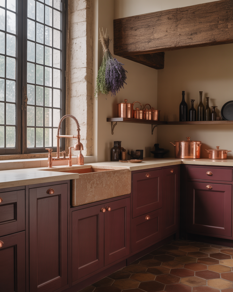
The secret is pairing it with warm stone tones rather than cool whites, which would make the red read too harsh. Natural stone counters, warm linen walls, and matte black or aged copper hardware create a palette that’s deeply personal and incredibly livable. This isn’t a trend kitchen — it’s a kitchen that looks like it evolved over decades.
Details at a glance
| Cabinet Color | COAT Devil & The Detail / F&B Rectory Red |
| Wall Color | F&B Setting Plaster / SW Accessible Beige |
| Hardware | Matte Black or Aged Copper |
| Countertop | Warm Gray Limestone or Aged Concrete |
| Best For | Traditional, Eclectic, Maximalist |
| Mood | Rich, Dramatic, Warm |
✦ Designer Tip: If full burgundy cabinetry feels too bold, use it only on the kitchen island while keeping perimeter cabinets in warm linen. The island becomes an anchor piece — like a piece of furniture rather than built-in joinery.
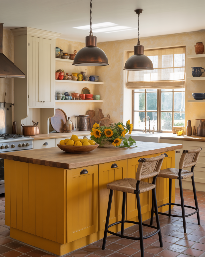
PALETTE 04
Terracotta + Olive Green
| Terracotta | Olive | Peach Clay | Sand | Walnut |
Terracotta and olive green are two of the most deeply earth-connected colors in design — and when placed together in a kitchen, they create something that feels ancient, warm, and profoundly right. This is the palette of sun-baked Mediterranean villages, of handmade pottery and wild herbs growing in clay pots on a windowsill.
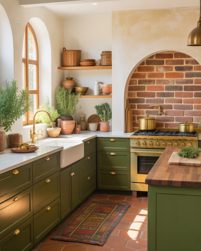
The key to avoiding a rustic cliché is in the finishes: use terracotta on walls or as an accent tile rather than painting every cabinet, and choose a more sophisticated olive (think deep, complex, almost military green) for the cabinetry itself. Walnut countertops and natural stone floors tie the palette together with organic warmth.
Details at a glance
| Cabinet Color | SW Oakmoss / BM Dried Thyme |
| Accent / Wall | Terracotta plaster or tile feature |
| Hardware | Unlacquered Brass or Bronze |
| Countertop | Butcher Block Walnut or Terra Stone |
| Best For | Mediterranean, Bohemian, Rustic Modern |
| Mood | Earthy, Vibrant, Joyful |
✦ Designer Tip: Introduce terracotta through handmade Zellige or encaustic floor tiles instead of paint — the variation in tile tone adds incredible richness and depth that flat painted terracotta simply cannot replicate.
PALETTE 05
Smoked Teal + White Marble
| Smoked Teal | Deep Teal | Marble White | Aged Brass | Matte Black |
Smoked teal occupies that rare design sweet spot: it’s cooler than green, warmer than blue, and somehow more interesting than both. Designers describe it as having “real bite” — a color with depth and personality that refuses to be ordinary. Against white marble with bold dark veining, it creates a palette that feels like it belongs in an upscale Manhattan apartment or a renovated Victorian townhouse.
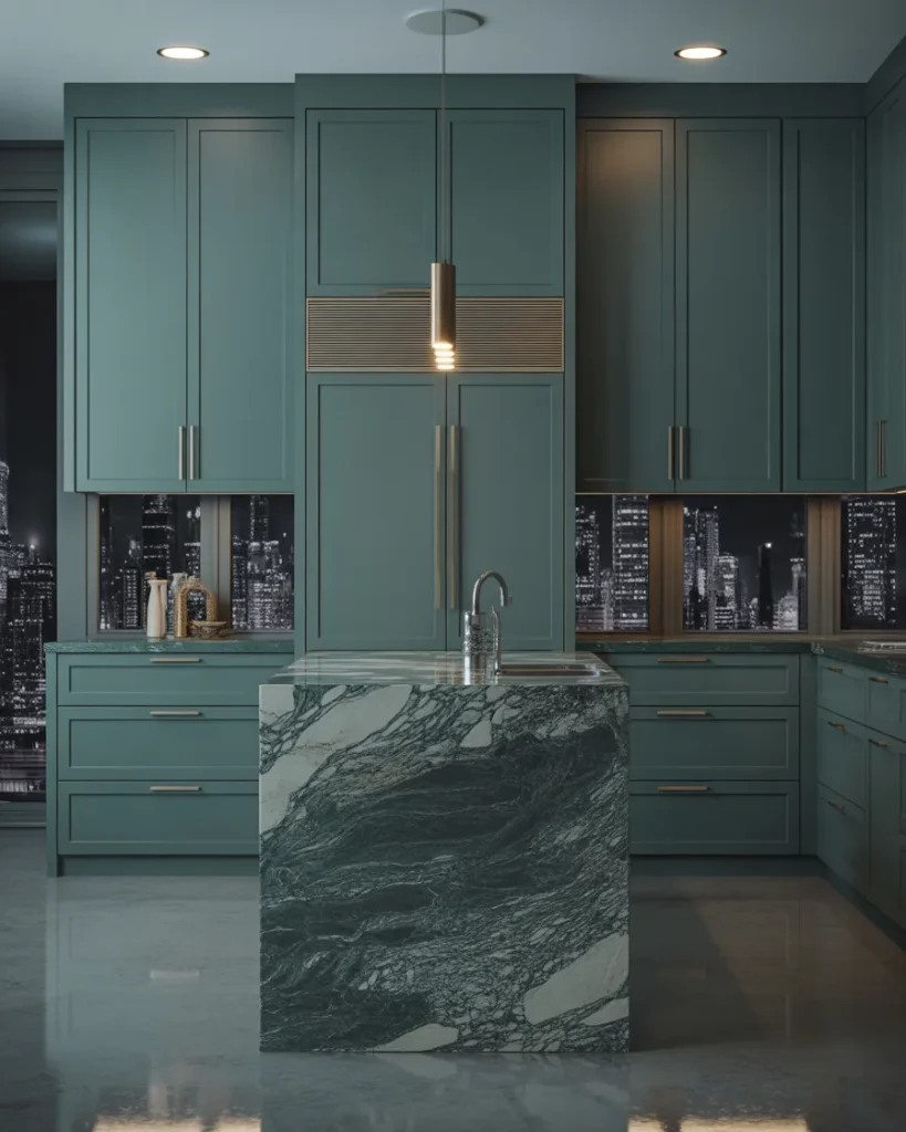
This palette works best in kitchens with good natural light, where the teal can shift and deepen throughout the day. Brass accents add just enough warmth to prevent the combination from reading too cold, while matte black fittings sharpen the overall graphic quality of the space.
Details at a glance
| Cabinet Color | WGSN Smoked Teal / F&B Mizzle / SW Underseas |
| Hardware | Brushed Brass + Matte Black mix |
| Countertop | Calacatta marble or bold-veined quartz |
| Best For | Contemporary, Transitional, Urban |
| Mood | Sophisticated, Moody, Dramatic |
✦ Designer Tip: Use this palette for a butler’s pantry or coffee station rather than the entire kitchen — a “jewel box” approach that lets you be bold in a smaller footprint before committing to a full remodel.
PALETTE 06
Warm Mushroom + White Oak
| Mushroom | Taupe Rose | Sand | Oak Honey | Warm White |
If sage green was 2024’s neutral, warm mushroom is 2026’s. This is the color that interior designers describe as “perfectly brewed coffee” — not too light, not too bold, carrying enough warmth to feel inviting without the weight of a full earth tone. Paired with white oak cabinetry (celebrating natural wood grain in all its glory), this palette feels grounded, organic, and beautifully modern.
Mushroom tones work across virtually every kitchen style — from minimalist Japandi layouts to more traditional designs — because they function like a sophisticated beige that got a Master’s degree. Brushed brass or champagne gold hardware adds just enough glimmer, while the wood grain does all the textural heavy lifting.
Details at a glance
| Cabinet Color | BM Pale Smoke / SW Accessible Beige warm |
| Wood Accent | White Oak with visible grain, light-stained |
| Hardware | Brushed Brass or Champagne Bronze |
| Countertop | Warm White Quartz or Honed Dolomite |
| Best For | Japandi, Scandinavian, Modern Organic |
| Mood | Serene, Timeless, Organic |
✦ Designer Tip: The magic of mushroom is in layering — use the same hue at different depths across cabinetry, walls, and textiles. A tone-on-tone mushroom kitchen where the walls are two shades lighter than the cabinets feels extraordinarily refined.
PALETTE 07
Forest Green + Natural Stone
| Forest | Moss | Sand Stone | Brass | Chalk |
Deep, forest-dark greens have dominated design conversations since 2024, and they are not going anywhere. What’s evolving in 2026 is how they’re being used: less as a trend statement, more as a permanent architectural choice — the kind of color that reads as “this kitchen has always been this color and always will be.” Forest green cabinets against natural stone have a gravitas that’s genuinely hard to beat.
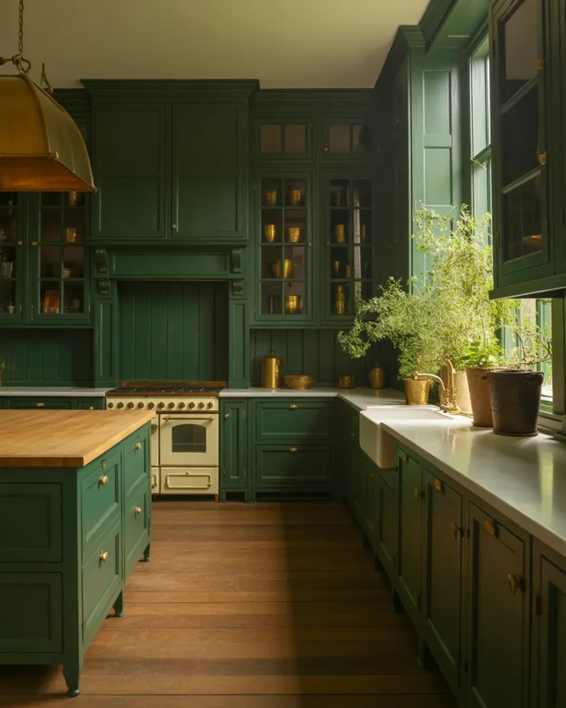
The richness of the green is best balanced by the raw imperfection of natural stone — whether honed limestone, leathered quartzite, or rough-hewn granite. This palette pairs warmth (brass hardware, wood accents) with depth (the green itself) in a way that feels like the very definition of understated luxury.
Details at a glance
| Cabinet Color | F&B Studio Green / BM Hunter Green |
| Wall Color | F&B Shaded White / BM Chantilly Lace |
| Hardware | Unlacquered or Brushed Brass |
| Countertop | Leathered Quartzite or Honed Limestone |
| Best For | Traditional, Transitional, Country House |
| Mood | Rich, Grounded, Confident |
✦ Designer Tip: Consider using forest green on floor-to-ceiling cabinetry — the tall, uninterrupted color creates a dramatic architectural statement that feels more like a built-in library than a kitchen.
PALETTE 08
Muted Lavender + Warm Greige
“Tailored and architectural — pastels have officially grown up”
| Lavender | Soft Violet | Greige | Brass | Linen |
2026 marks the moment pastels officially left the nursery and walked confidently into the kitchen — dressed in a tailored blazer. Muted lavender is part of the “Frosted Tints” palette championed by Sherwin-Williams this year: soft and hazy, the color of morning fog catching the first light rather than a field of synthetic flowers. There is nothing sugary about it.
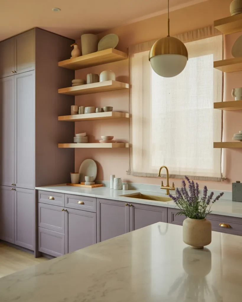
Paired with warm greige cabinets or walls, lavender becomes an unexpected accent that reads sophisticated rather than sweet. The combination works particularly well in kitchens where matte brass hardware and pale oak accents create warmth that stops the palette from going cool.
Details at a glance
| Cabinet Color | SW Modern Lavender / BM Bunny Gray |
| Wall Color | SW Accessible Beige / F&B Elephant’s Breath |
| Hardware | Matte Brass or Warm Satin Nickel |
| Countertop | Pale Veined Quartz or Warm White Marble |
| Best For | Eclectic, Modern, Cottagecore-Adjacent |
| Mood | Dreamy, Refined, Surprisingly Calm |
✦ Designer Tip: Think of muted lavender as your “secret weapon” neutral — it reads almost gray-blue to some eyes, which means you can use it confidently in a kitchen where you thought you wanted gray, and enjoy the quiet surprise of its violet depth.
PALETTE 09
Coastal Sand + Soft Blue
| Dune Sand | Coastal Blue | Warm Tan | Sea Foam | Warm Brass |
Coastal kitchen design in 2026 has moved significantly away from the nautical clichés of navy anchors and lobster prints. Today’s coastal palette is about natural tones: the actual colors of a beach at dawn — pale sand, muted blue-gray water, bleached driftwood, and the subtle warmth of sea glass. It is quiet luxury applied to the seaside aesthetic.
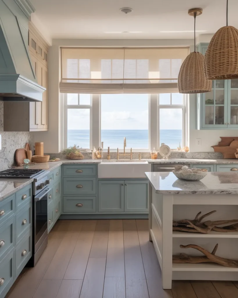
Soft muted blues on lower cabinets paired with sandy linen upper cabinets or walls creates a palette that feels airy without being cold. Natural materials — rattan, seagrass, bleached wood — play beautifully within this color story. This is the palette for open-plan kitchens that connect to outdoor living spaces.
Details at a glance
| Cabinet Color | BM Newburyport Blue / SW Aqua Smoke |
| Wall Color | BM Sand Dollar / SW Accessible Beige |
| Hardware | Warm Brushed Nickel or Unlacquered Brass |
| Countertop | White Granite or Sea-veined Quartz |
| Best For | Coastal, Transitional, Open-Plan |
| Mood | Airy, Fresh, Relaxed Luxury |
✦ Designer Tip: The new coastal rule: replace anything with an anchor or lobster on it with natural rattan, seagrass, and bleached wood. The materials tell the coastal story far more beautifully than any motif ever could.
PALETTE 10
Aubergine + Champagne Gold
| Aubergine | Deep Plum | Champagne | Blush Stone | Matte Black |
Aubergine — deep, regal, violet-touched purple — is 2026’s most daring kitchen color, and the designers brave enough to use it are creating spaces that stop people in their tracks. Part of the broader jewel-tones movement, aubergine creates a kitchen that feels simultaneously luxurious and intimate, a space with genuine theatrical presence.
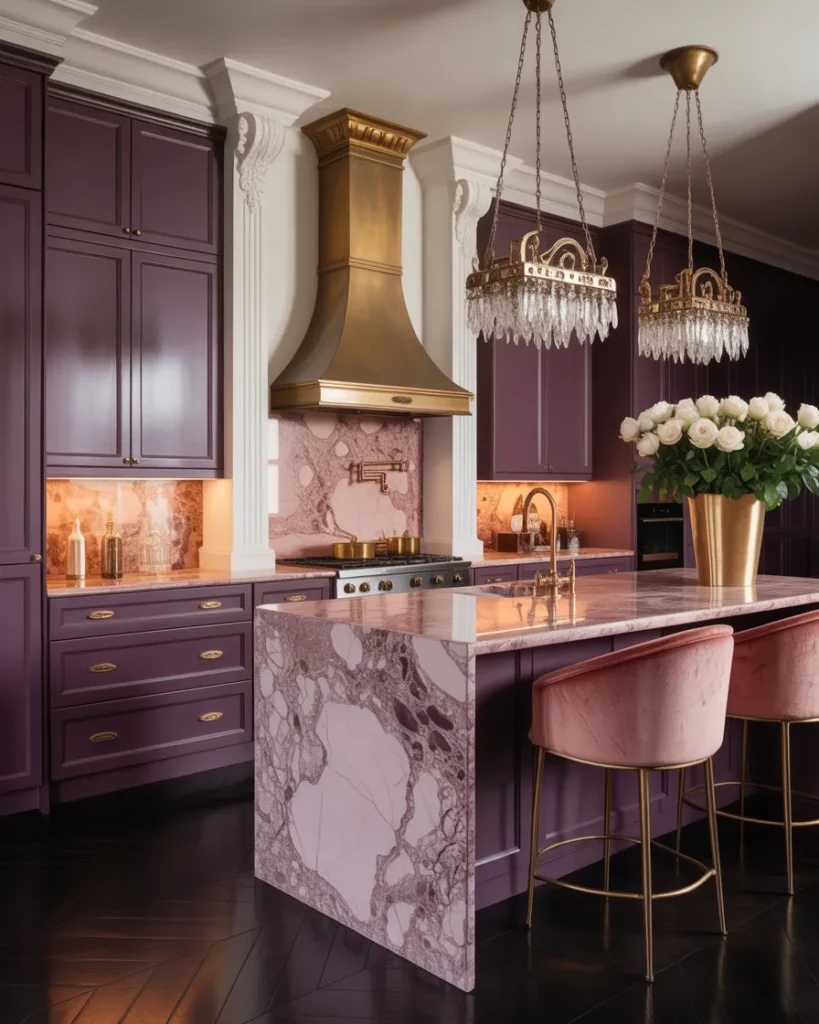
This isn’t for the faint-hearted, but the rewards are extraordinary. Against champagne gold hardware and warm blush stone countertops, aubergine cabinets feel sumptuous rather than oppressive. The key is keeping walls and ceilings in very pale linen or cream so the color has room to breathe — and adding generous lighting so the kitchen glows rather than broods.
Details at a glance
| Cabinet Color | F&B Brassica / BM Amethyst Shadow |
| Wall Color | F&B All White / BM White Dove |
| Hardware | Champagne Gold / Polished Brass |
| Countertop | Warm Blush Quartz or Pink-Veined Marble |
| Best For | Maximalist, Eclectic, Statement Interiors |
| Mood | Regal, Dramatic, Unforgettable |
✦ Designer Tip: Light this kitchen generously — under-cabinet lighting, pendant lights, and even a statement chandelier over the island. Aubergine absorbs light beautifully, so the more luminous sources you layer in, the more the color reveals its extraordinary depth.
PALETTE 11
Ochre + Warm White
| Ochre | Mustard | Warm White | Warm Wood | Straw |
Chartreuse and ochre are among 2026’s boldest calls in kitchen design — and ochre in particular lands in a sweet spot between cheerful and sophisticated. Unlike bright yellow, which can feel harsh under kitchen lighting, ochre carries enough brown and warmth to feel intentional and earthy rather than electric. Designers are calling it “optimism distilled into a paint color.”
On a kitchen island or lower cabinets paired with warm white upper cabinets, ochre reads beautifully through every light condition — golden at noon, amber-warm in the evening, and straw-soft in overcast morning light. A chunky wood island top and woven bar stools complete the look with texture-forward warmth.
Details at a glance
| Cabinet Color | BM Hawthorne Yellow / SW Chrysanthemum |
| Wall Color | SW Creamy / BM White Dove |
| Hardware | Matte Black or Dark Bronze |
| Countertop | Warm Cream Quartz or Butcher Block |
| Best For | Eclectic, Bohemian, Farmhouse Modern |
| Mood | Joyful, Warm, Optimistic |
✦ Designer Tip: Use ochre on the island only while keeping all perimeter cabinetry in warm white — this “pop of color” approach lets the ochre function as a statement piece, like a piece of furniture, without overwhelming the kitchen.
PALETTE 12
Two-Tone: Inky Blue + Creamy Linen
| Inky Blue | Midnight | Creamy Linen | Warm Brass | Stone |
Two-tone kitchen design is one of the most enduring trends of the past decade — and in 2026, the color pairings are becoming more nature-inspired and harmonious. Inky navy blue lower cabinets against creamy linen upper cabinets is a combination so balanced, so visually satisfying, that it has achieved near-perennial status in high-end kitchen design.
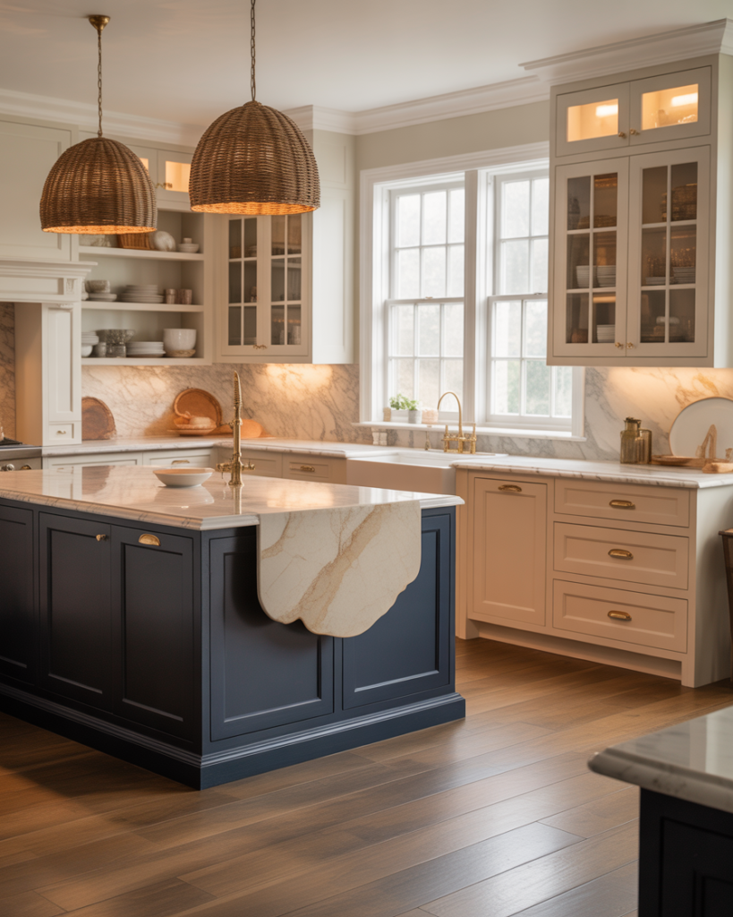
The trick is using a blue that reads deep and architectural (almost charcoal-navy) rather than bright or saturated. This creates maximum contrast with the linen uppers while still feeling grounded and sophisticated. Warm brass hardware bridges the two tones beautifully, while marble countertops with warm undertones prevent the dark cabinets from making the kitchen feel heavy.
Details at a glance
| Lower Cabinets | F&B Hague Blue / BM Van Deusen Blue |
| Upper Cabinets | F&B Wimborne White / SW Creamy |
| Hardware | Brushed Brass — consistent throughout |
| Countertop | Warm White Marble or Cream Quartz |
| Best For | Traditional, Transitional, Classic |
| Mood | Classic, Balanced, Timeless |
✦ Designer Tip: In two-tone kitchens, keep all hardware the same finish throughout both cabinet colors — this is the element that ties the palette together and makes it read as intentional rather than indecisive.
PALETTE 13
Japandi: Pale Celery + Raw Wood
| Pale Celery | Soft Sage | Raw Linen | Natural Oak | Washi |
Japandi — the design philosophy that marries Japanese wabi-sabi with Scandinavian hygge — continues to exert a profound influence on 2026 kitchen design. The pale celery palette sits at the heart of this movement: a near-weightless green that catches morning light and turns it into something almost luminous. Sherwin-Williams’ “Frosted Tints” collection captures exactly this quality — soft, hazy, and complex in a way that flat whites simply cannot be.
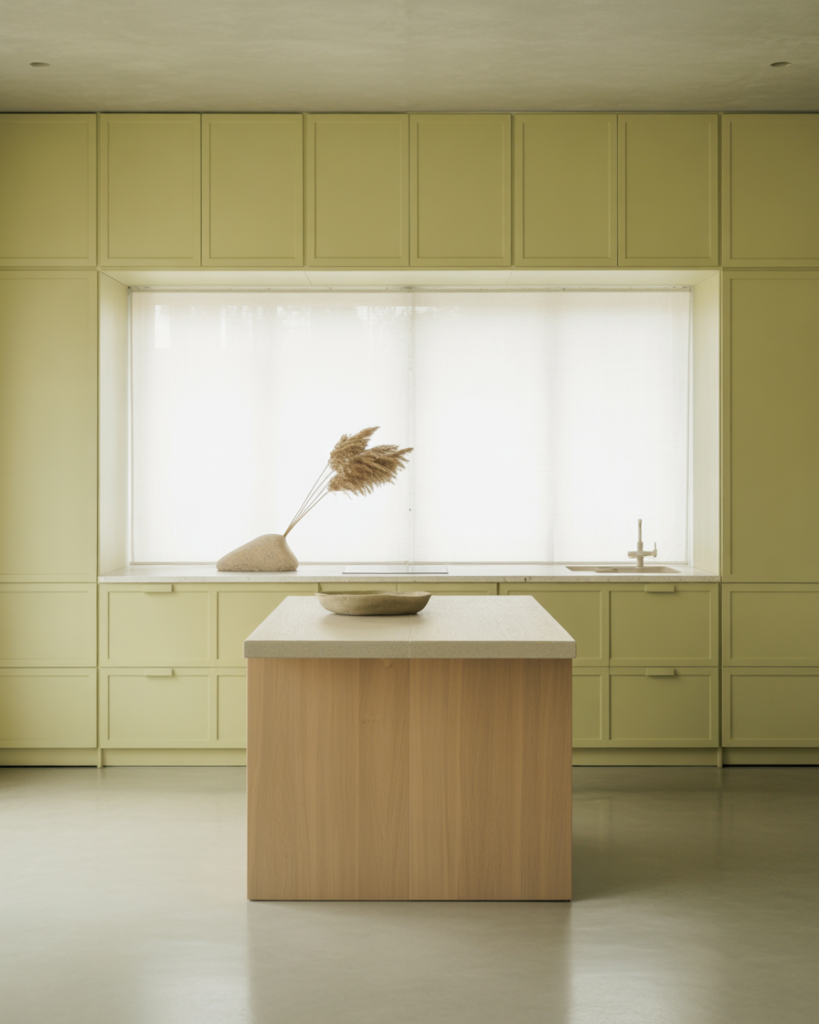
Raw, natural wood is the essential partner in this palette — specifically white oak or ash, lightly stained or left entirely natural, celebrating every grain line and imperfection. This is the Wabi-Sabi element of Japandi: beauty found in the natural and the unfinished. Matte brass hardware keeps the palette warm while remaining minimal enough to honor the overall serenity of the design.
Details at a glance
| Cabinet Color | SW Frosted Tints / BM Pale Celery 618 |
| Wood Accent | White Oak or Ash — light natural stain |
| Hardware | Matte Brass — minimal, thin profile |
| Countertop | Honed Light Limestone or White Soapstone |
| Best For | Japandi, Minimalist, Zen-Inspired |
| Mood | Serene, Meditative, Deeply Calm |
✦ Designer Tip: In Japandi kitchens, restraint is the ultimate luxury. Resist the urge to fill countertops with accessories — keep surfaces nearly empty, with just one or two considered objects: a single ceramic bowl, a small wooden cutting board, a sprig of dried botanicals.
How to Choose Your Kitchen Color Palette
Feeling inspired — but overwhelmed? Here’s how the designers actually narrow it down:
| Consider Your Light | North-facing kitchens need warm hues. South-facing can handle cooler tones beautifully. |
| Think About Longevity | Pick a color you’d wear in 10 years. Moody, natural tones outlast trend colors. |
| Start With Hardware | Choose your hardware finish first — it anchors every other color decision in the kitchen. |
| Test At Scale | Always paint a large sample (A3 size minimum) and observe it for 3 days before committing. |