How to Choose the Perfect Color Scheme for Your Bedroom
You painted your bedroom last year. It looked perfect in the store. Now, every morning you wake up and something feels off – but you can’t explain why. That feeling is not random. Your bedroom color is working against you, not for you. The good news? Fixing it is simpler than you think.
Why Your Bedroom Color Scheme Matters More Than You Think
Your bedroom color is the first thing your brain processes every morning. It sets your mood before you even check your phone. Color psychology research from the Sleep Foundation shows that wall color directly affects sleep quality and stress levels.
The wrong color can keep you wired at night. The right one wraps you in calm. This is not just about aesthetics – it’s about how your body physically responds to what it sees.
What Is the Best Color Scheme for a Bedroom?
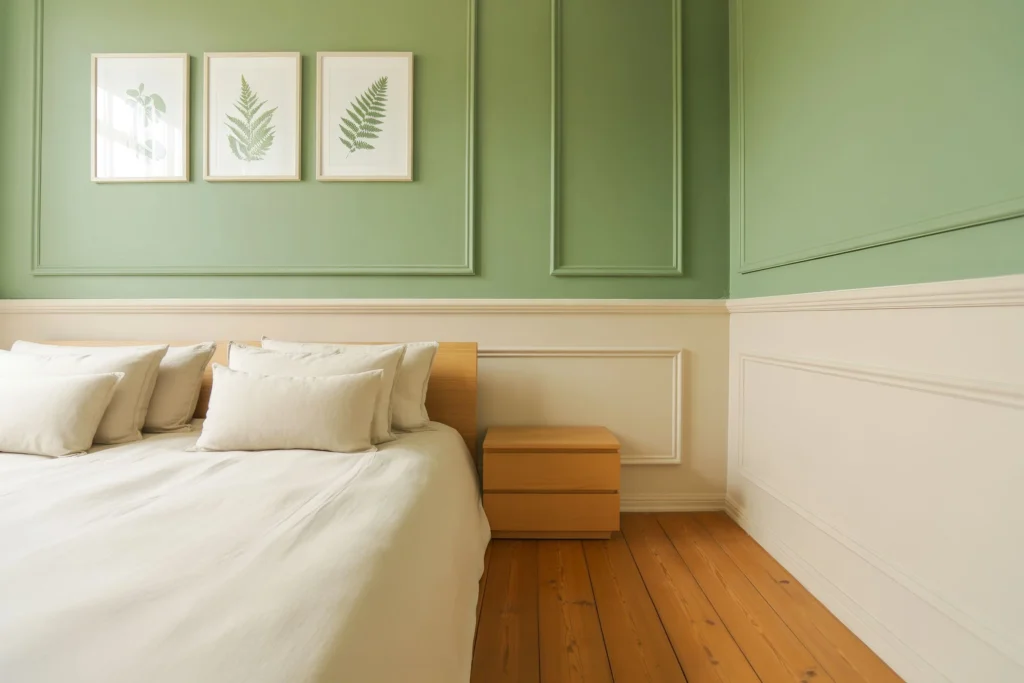
The best bedroom color scheme is a soft, neutral base paired with one accent color. Think warm whites, dusty blues, sage greens, or warm taupes. These colors lower cortisol levels and signal the brain it’s time to rest. Research from the British sleep charity Silentnight confirms that blue-toned bedrooms produce the most restful sleep.
Most people overthink bedroom color. They chase trends instead of chasing calm. Your bedroom is not a showroom – it’s your recovery space.
1. Start With the 60-30-10 Color Rule
The 60-30-10 rule is the easiest way to build a bedroom color scheme. It means 60% dominant color (walls), 30% secondary color (bedding, curtains), and 10% accent color (decor, hardware). Interior designers use this rule because it creates visual balance without feeling cluttered.

Pick your dominant color first. Everything else flows from that choice. Think of it like a base coat – it holds the whole room together.
2. Cool Colors Create a Sleep-Ready Bedroom
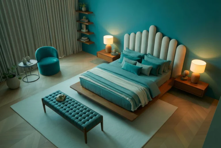
Cool colors like soft blue, lavender, and sage green physically slow your heart rate. They reduce blood pressure and tell your nervous system to wind down. A 2012 Travelodge study found that people in blue bedrooms slept an average of 7 hours 52 minutes per night.
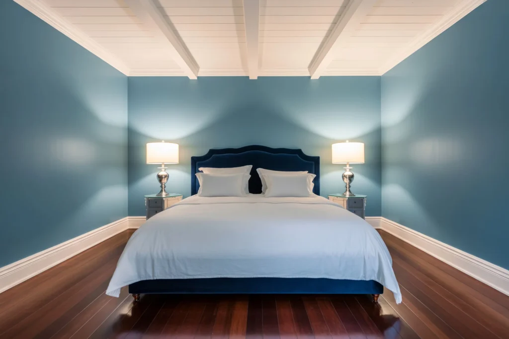
Blue is the #1 recommended bedroom wall color by sleep researchers globally. It’s not a coincidence – it mimics the color of sky and open water, two things the human brain finds deeply calming. Start with a blue-based palette if sleep is your top priority.
📖 Want to make the most of your small bedroom? Check out our full guide below:
➤ How to Style a Small Bedroom for Maximum Comfort3. Warm Neutrals Work for Cozy, Intimate Bedrooms
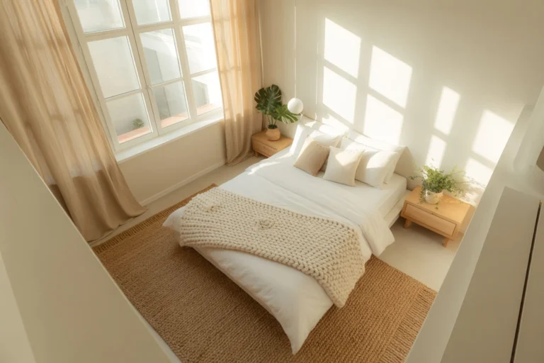
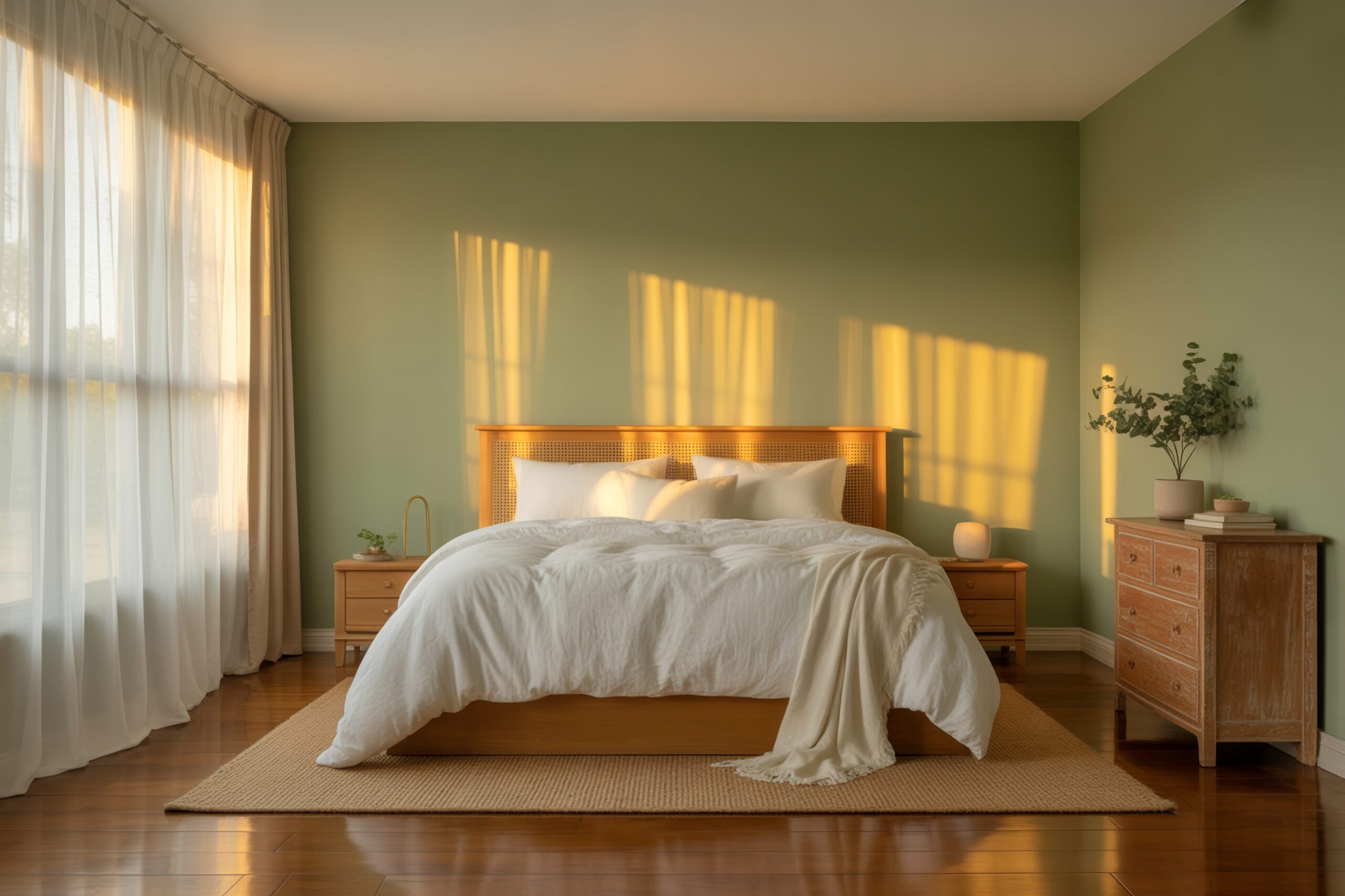
Warm neutrals – think sand, blush, warm taupe, and soft terracotta – create a bedroom that feels like a warm hug. These tones are grounding without being heavy. They work especially well in smaller bedrooms because they add depth without making the room feel tight.
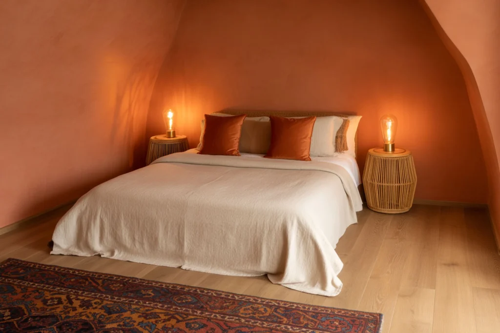
Terracotta and warm beige are having a major moment in interior design right now. They pair beautifully with natural textures like linen, rattan, and wood. If you want your bedroom to feel like a boutique hotel, warm neutrals are your answer.
4. How to Choose Bedroom Colors Based on Room Size
Light colors make small bedrooms feel bigger. Dark colors make large bedrooms feel cozier and more defined. This is basic color perception – lighter shades reflect light, darker shades absorb it.
If your bedroom is under 150 square feet, stick to whites, soft creams, or pale pastels. For larger rooms above 200 square feet, you can go bolder with deep greens, navy, or charcoal without feeling boxed in. The room’s natural light also plays a huge role here.
5. Match Your Color Scheme to Your Natural Light
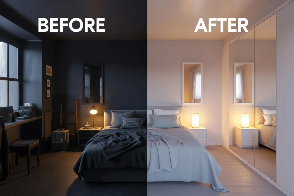
North-facing bedrooms get cooler, weaker light. Painting them in cool grays or blues will make them look dull and flat. Warm whites, soft yellows, and peachy tones counterbalance the cold light and make the room feel alive.
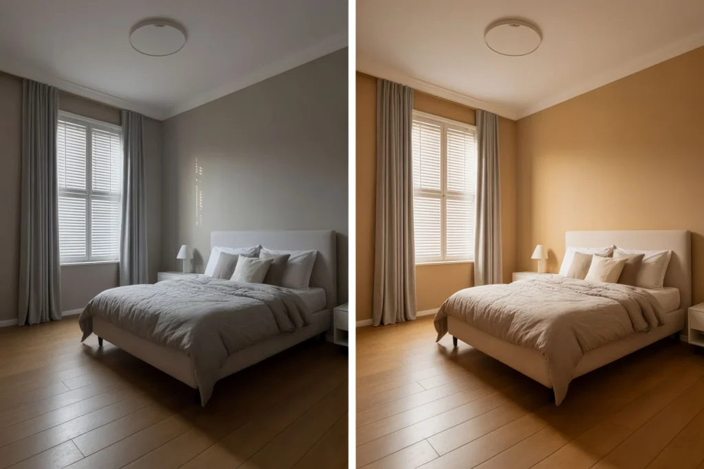
South-facing bedrooms get strong, warm natural light all day. They can handle both cool and warm colors without looking off. Test your paint colors at different times of day before committing – morning light and evening light tell two completely different stories.
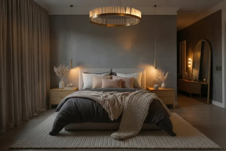
6. Accent Walls – When One Bold Color Is Enough
An accent wall lets you use a bold color without overwhelming the space. It draws the eye to a focal point – usually the wall behind the bed. This trick works in bedrooms of any size and is perfect if you’re nervous about committing to a full room of bold color.
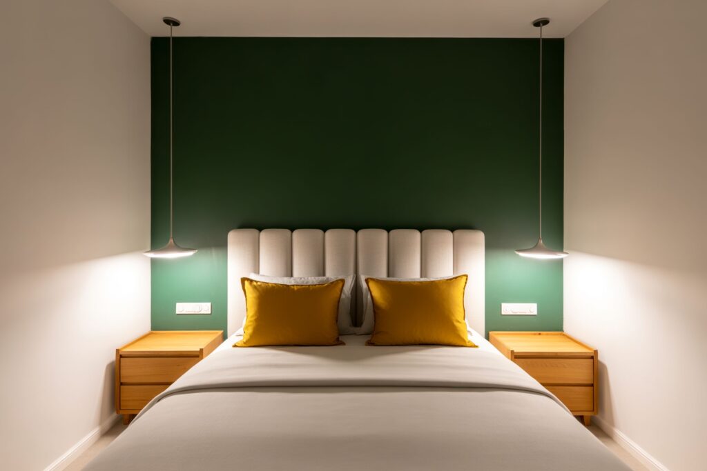
Deep green, navy blue, burnt orange, and moody plum all work brilliantly as accent colors. Keep the other three walls neutral so the accent can do its job. One strong wall is almost always more effective than four walls fighting for attention.
7. How to Use Bedroom Color to Reflect Your Personality
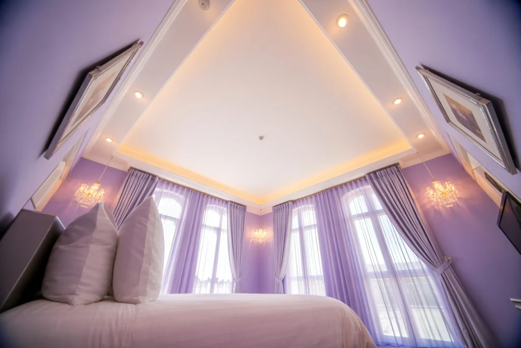
Your bedroom color should feel like you, not a Pinterest board you found in 2019. Bold, expressive people gravitate toward jewel tones – emerald, sapphire, amethyst. Calm, minimal personalities tend toward whites, soft grays, and muted greens.
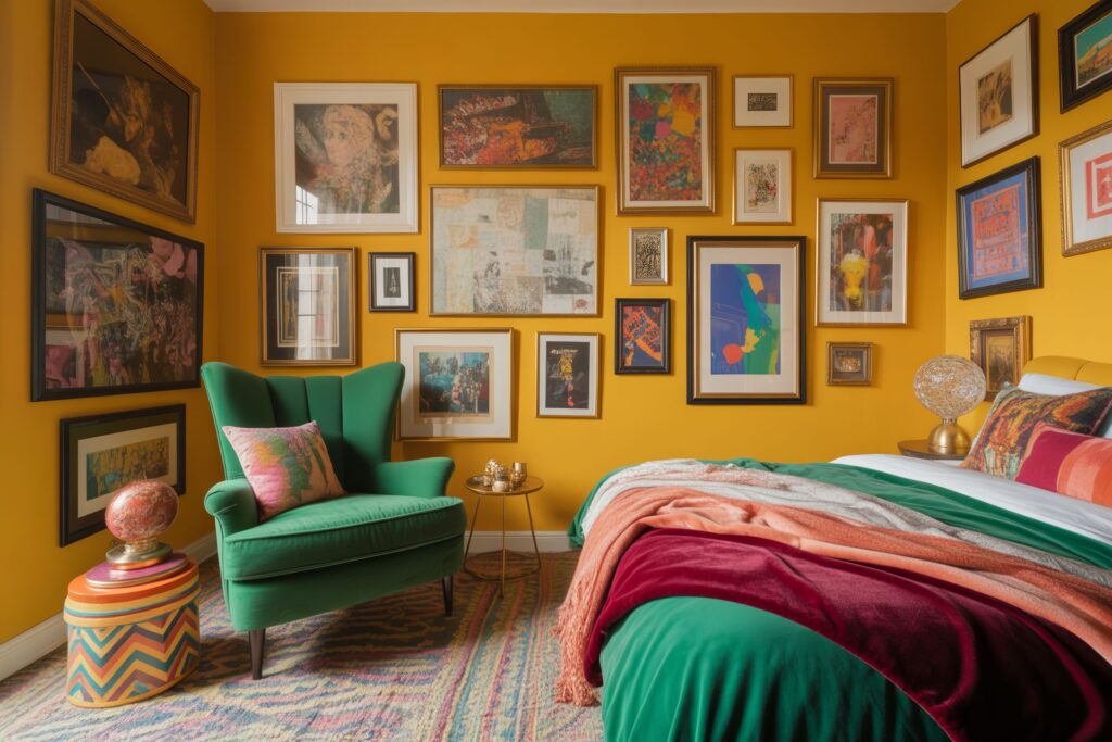
There’s no wrong personality choice – just wrong execution. If you love yellow, go for a warm, muted gold instead of neon. The goal is a color that makes you feel at home the second you walk through the door.
8. The Role of Undertones in Bedroom Paint Colors
Undertones are the hidden colors sitting beneath the surface of your paint. A white wall can look yellow, pink, or blue depending on its undertone. Getting undertones wrong is the number one reason people repaint their bedroom twice.
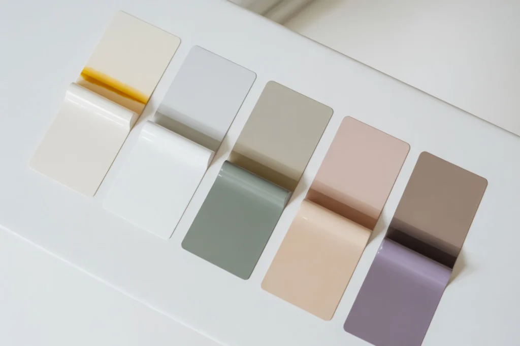
Always test paint swatches in your actual bedroom, not in the hardware store. Hold the swatch against your bedding, flooring, and furniture. The undertone that clashes with your wood floor will ruin the entire color scheme, no matter how much you love the color on the can.
9. Two-Color Bedroom Schemes That Always Work
Two-color bedroom schemes are foolproof when you follow the right pairings. Soft blue and warm white is the most universally loved combination. Sage green and off-white is the fastest growing pairing on design platforms right now.
Other proven combinations include blush pink with warm gray, navy blue with soft gold, and charcoal with dusty rose. The key is making sure one color is dominant and the other supports it. When both colors compete equally, the room feels restless instead of restful.
10. How Bedroom Ceiling Color Changes Everything
Most people paint their ceiling white and forget about it. But ceiling color dramatically affects how a room feels. A white ceiling lifts a room upward and makes it feel taller. A ceiling painted the same color as the walls creates a cocooning, intimate effect.
Dark ceilings on light walls are a design secret that feels luxurious in person. Think of a deep navy ceiling over soft white walls – it mimics a night sky above you. If you want your bedroom to feel like a five-star retreat, start looking up.
11. Bedroom Color Schemes by Style
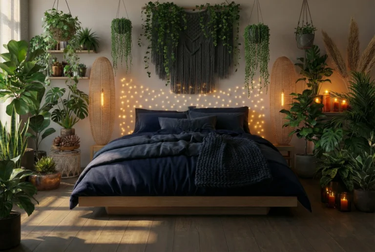
Every bedroom style has a signature color palette. Scandinavian bedrooms lean on whites, light grays, and natural wood tones. Bohemian bedrooms thrive on warm terracotta, deep burgundy, rust, and earthy green.

Modern luxury bedrooms often go with deep charcoal, slate, navy, or forest green paired with metallic accents. Coastal bedrooms stick to soft aqua, sandy beige, and crisp white. Knowing your style first makes choosing your palette ten times easier.
12. Mistakes to Avoid When Picking Bedroom Colors
The biggest bedroom color mistake is choosing a color you love in someone else’s home. Every room is different – the light, the furniture, and the size all change how a color looks. What works in a south-facing loft in California won’t work in a north-facing apartment in London.
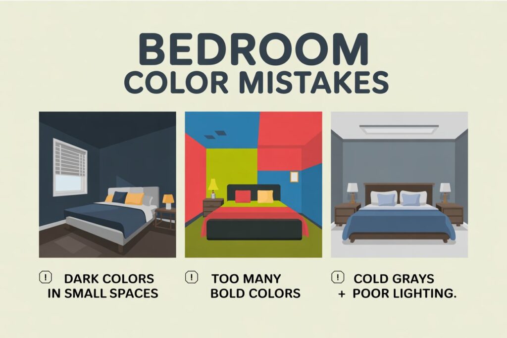
Other common mistakes include skipping paint samples, choosing colors based on a screen (monitors lie about color), and forgetting to account for furniture undertones. Spend a week living with a large painted sample before making a final decision. Your future self will thank you.
Final Thought:
Bedroom color is personal. No rule book overrides how a color makes you feel when you walk through your door. Start with the mood you want – calm, cozy, bold, or clean – then build your palette from there.
The best bedroom color scheme is one you stop noticing after a few days. That’s the sign it fits. It becomes the backdrop to your life, not the distraction from it.